LAYOUT TRENDS FOR 2015

I would like to feature and summarise an article I read in the Web designer depot about this year layout trends.
If we looked back 10 years we will find that the web had the same go-to pattern consisted of a header, footer, sidebar and content area. It was the expected layout for the web. Current web design you will no doubt notice that the fundamental structure for web pages is anything but fixed. The new norm as it were, is that there appears to be no fixed formula at all.
Although we can observe several trends in layout design representing unusual layouts, unusual as they don’t follow a strict formula. But they are trends because there’s hundreds of examples for each category.
This blend of trends will hopefully be an inspiration for your future projects.
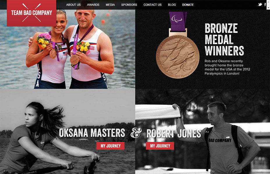
SPLIT SCREENS
The sites that split the screen using a vertical divide.
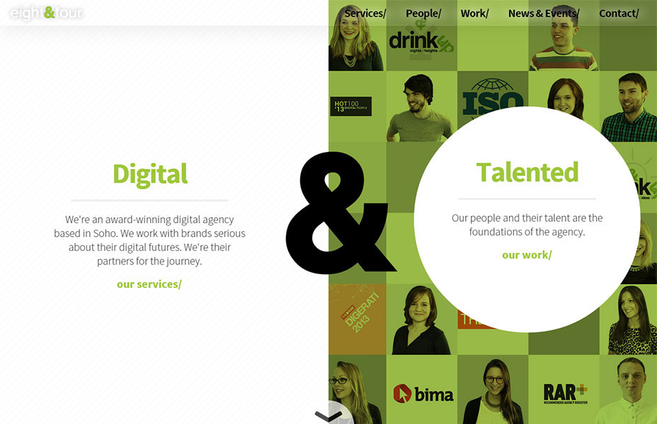
You can use it when you either want to promote two things, two elements of equal importance. Or to remark trough two elements what defines the company, which is the duality that gives the core strengths.
This approach allows the user to rapidly select between the two elements and easily explain the corporate identity of the company and give a lasting impression.
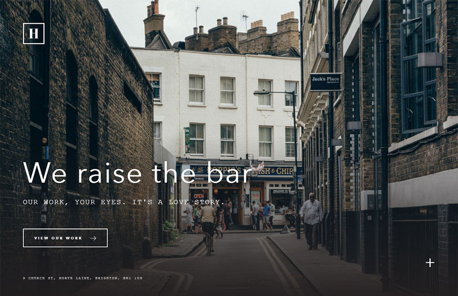
NO DECORATIONS!
A common trend now, which I specially like, is to remove all of this extra containing elements (boxes, borders, shapes, etc,) that we usually use to separate the content of a page (header, footer,…). Check these sites.
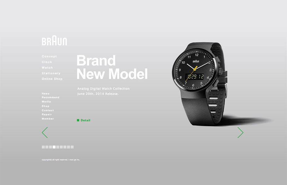
In this example, you can appreciate no limitation between header and footer. It feels more like an interactive kiosk instead. The hierarchy of content is done through a left to right division. As a consequence the beautiful products shine through.
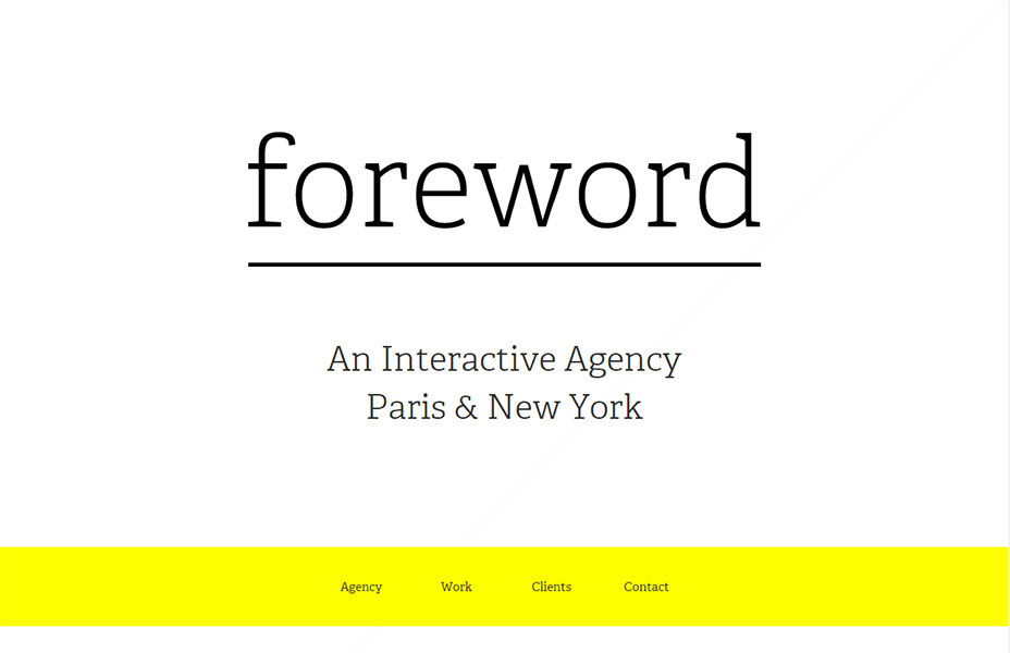
Here, the content is greatly emphasized. Instead of reading a header first, you read the name of the company and the statement about what they do (and where they do it). Followed by the global navigation.
It is a good way to emphasise the brand, and make a good first impact, before getting people to navigate. Very neat.
MODULAR OR GRID BASED
This trend is not exactly new, we have used it in the past too indeed. Little by little it’s gaining notoriety thanks to the introduction of responsive web design. The layout built on modular or grid-like structures can flex based on the screen size.
This example perfectly demonstrates the idea. The design is completely responsive. As the screen size changes each module adapts and sizes to fit the space.
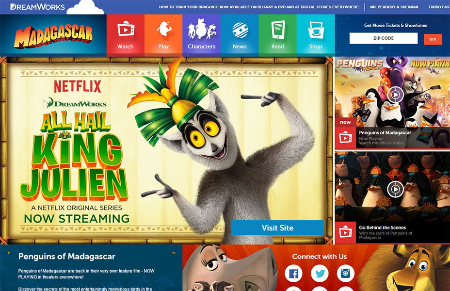
In this example there is an important design element at work here, which the previous example lacked. The size of the modules vary to reflect the order of importance and its place in the hierarchy.
SINGLE SCREEN
When the design adapts to completely fill the screen, without scrolling, which means that the content has to be extremely focused, and the hierarchy of content clearly established.
Author Profile

スターフィールド編集部
SHARE