2014/10/22
FROONT: Sharing Responsive Web Design As Easy As Sharing Code
After approximately a year in public beta version, FROONT version one came live this October 13th.
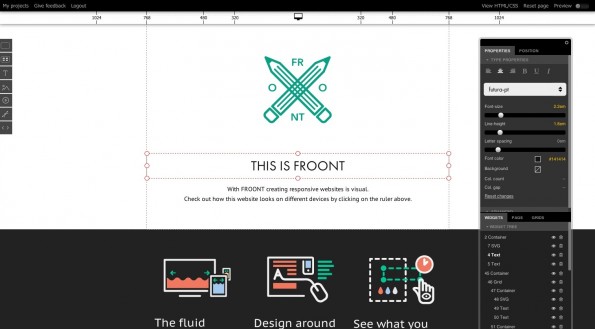
FROONT is a tool for designers to speed up the process of protytype and design responsive web sites.
Take elements from other pages to build your own. Work in the environment you’re designing for – the browser. You have full control over desktop and mobile layouts, which are responsive from the start. Deliver fully working code without writing it. Connect it to the web, or simply zip the code and send to your client or developer.
Intro to FROONT from Froont on Vimeo.
In other words, rather than designing in a page layout program or designing in Photoshop, designers can actually work right in the browser thanks to Froont’s pre-existing browser-based visual editor. You can explore FROONT web designs library and get inspired or literally take elements from pages you like to build your own.
This tools allows designers to actually build for various layouts at the same time. So any time of your design process you can check how your design looks in various devices: PC, tablet screen, phone screen…making much faster the process to build for different environments.
The usual way of designing websites is that the design of the website is given to the developer, this approach however, can involve a lot of unnecessary back and forth as the design gets lost in translation. The responsive designs of FROONT, built using HTML/CSS and hosted in the cloud, can be viewed and shared instantly in a web browser, on any device being targeted. And when it’s time to hand off the design to a developer, instead of a static PNG file or something similar, in theory they’re given “nice, clean HTML/CSS or the ‘face’ of the website already made,” says the company.
Froont isn’t so much aiming at simplifying coding but providing better tools for design. It can be used for production, however, designs usually need to be customised in several ways upon client requests, but it is definitely a good starting point.
In some ways it’s similar to how something like Github works for raw code, and the wider open source movement as a whole, but for visual web designers. As Froont co-founder and CEO Sandijs Ruluks says “The same applies for Github, where people are embracing the community and reuse code made by others. The interesting part is that open-sourced coding is now perceived as something totally normal and its benefits can’t be denied. Open-sourced design on the other hand, isn’t there yet, although we see the excitement around it”.
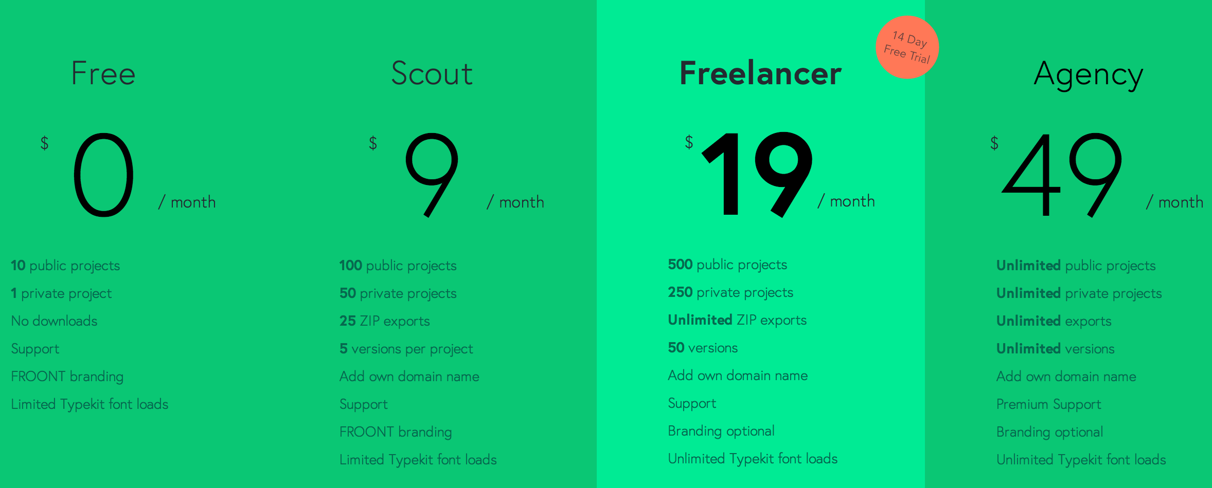
Pages created by non-paying users are always public and can be cloned, edited and reused by others. If you want to keep your work private you pay a subscription. Or, as Ruluks puts it, “for free you pay with sharing, for privacy you pay with money”. Here you have the pricing list.
Actually FROONT is not the only tool to create professional Responsive Website without code, but it is the only “free” version.
There’s also Webflow, Adobe Edge Reflow and Macaw . If you want to read more about the topic you might like to read this post of Awwwards.
Author Profile

スターフィールド編集部
SHARE