Infographics for Web designers

I would like to make a special mention about Awwards’ Infographics post for Web designers. The post collects a total of 44 Infographics complete with a vast quantity of information that I am sure both newbie and experienced designers are going to find out something new to learn.
The topics go from Web Design history, anatomy of effective Web Design, SEO, Colour Theory and Psychology, Typography, UE, Design trends, RWD, etc.
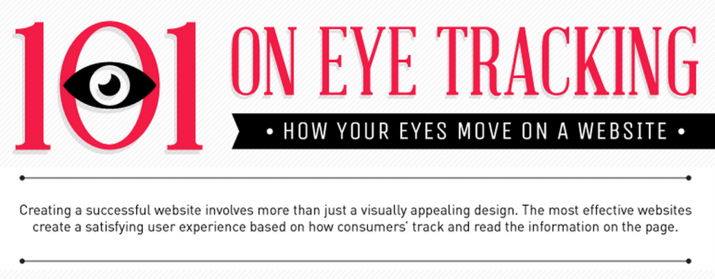
One of the Infographics I found more interesting and not as usually commented as others, like Color theory or RWD, is the Infographic about eye tracking technology in Web Design, in other words, about how your eyes move on a website.
Some interesting tips As it shows the Infographic:
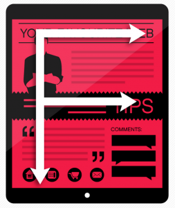
- Users maintain and “F/E” shaped viewing pattern
- 69% of the users’ time is spent looking at the left half of a Webpage.
- Logos and brands on top left side are remembered 58,4% more than other placement areas.
- Users spend 80% of their time looking at information above the “fold” or the portion of the web page that doesn’t require any scrolling.
Author Profile

スターフィールド編集部
SHARE


